
What I Use:
For digital art projects, I’m currently using a first gen iPad Pro 12-inch and an Apple Pencil. I love the larger screen size for drawing/painting, and the Pencil is one of the best input tools I’ve ever used. I just wish they had designed it so you can flip it around to the other side and automatically activate the eraser tool in your app like some others do.
Although I have used several, my app of choice is Autodesk Sketchbook. You get a mobile and desktop version for the same cost (I use it on my Mac at work too with a Wacom tablet). It also has a free version you can play around with to see if it’s a fit for you. Procreate is also an amazing app as well for the iPad Pro, but Sketchbook is my go-to app because I’m most comfortable with it (and because I can use it cross-platform).
https://www.sketchbook.com/?locale=en

Reference:
When I’m doing a portrait of a well known person and I want to get the likeness right, I usually use reference. This gives me something to look at and base the drawing from, rather than just trying to do it from memory. This can come in the form of a photo off the web, magazine article, or even a screen-grab from a video. Sometimes I use several different images - such as one for the head, another for a particular pose I’m trying to replicate, and another for environment/background. I used multiple reference images when I drew Han Solo because it was from the waist up - but for this close up Johnny Cash portrait, one image was enough.
When I’m doing a portrait of a well known person and I want to get the likeness right, I usually use reference. This gives me something to look at and base the drawing from, rather than just trying to do it from memory. This can come in the form of a photo off the web, magazine article, or even a screen-grab from a video. Sometimes I use several different images - such as one for the head, another for a particular pose I’m trying to replicate, and another for environment/background. I used multiple reference images when I drew Han Solo because it was from the waist up - but for this close up Johnny Cash portrait, one image was enough.
 |  |
Step 1: Rough Pencil Outline:
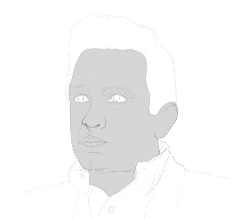
In this stage I make a rough pencil outline of the subject. Most of the time, I just look at the original image and try to replicate that as closely as possible in my drawing. But If I’m particularly concerned about getting the likeness right, I will sometimes use the good old-fashioned art-school grid method. If you’ve had an art class of any kind, then you may have heard of the grid method. Basically you place equidistant horizontal and vertical lines on your reference image in a grid pattern (I personally like either a 7 or an 8 segmented grid for portraits - anything more is just too complex in my opinion). Notice I'm using a 7-grid in the example. Now, I place the same grid in my drawing area and reduce the opacity to about half so it’s not too distracting. I then add a new layer underneath for my line drawing (don’t draw directly on your grid as it will be deleted later). By referencing where the grid lines fall on the original image, I can make sure my proportions and placement of major features are as accurate as possible in my drawing - which is very important for achieving a likeness.
This is definitely the most important step, so whether I use a grid or not, I take my time, making sure it looks the way I want it before proceeding. I frequently ask someone if they can identify the subject even though it’s just an early line drawing. It’s a huge bummer to spend a ton of time on the details stages later, only to discover you’ve placed a major feature too close/far apart or made something too big/small.
 |  |
Step 2: Color Blocking:
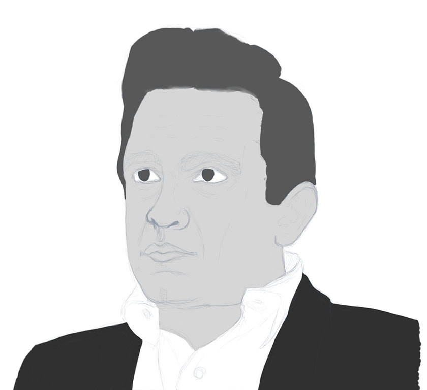
When I’m happy with the initial pencil outline, I move on to the color blocking stage. I create a new layer in my app and place it underneath the line drawing layer. Then I usually reduce the opacity of the line drawing layer to about half. This step is where I decide if I will be doing the painting in color, or in black and white. Either way, the method is the same. You will either be using colors, or shades of gray/black. In my mind I break the drawing up in chunks, like skin-tones, hair, clothing, etc. Then I usually start with the skin-tone chunk. I pick a mid-tone color (not the highlight or shadows - you will add these later). Now, using the paint brush tool, I paint the entire area with that mid-tone color (for example the face and neck). I follow the same procedure for the remaining chunks, usually hair next, then clothing/accessories.
When I’m happy with the initial pencil outline, I move on to the color blocking stage. I create a new layer in my app and place it underneath the line drawing layer. Then I usually reduce the opacity of the line drawing layer to about half. This step is where I decide if I will be doing the painting in color, or in black and white. Either way, the method is the same. You will either be using colors, or shades of gray/black. In my mind I break the drawing up in chunks, like skin-tones, hair, clothing, etc. Then I usually start with the skin-tone chunk. I pick a mid-tone color (not the highlight or shadows - you will add these later). Now, using the paint brush tool, I paint the entire area with that mid-tone color (for example the face and neck). I follow the same procedure for the remaining chunks, usually hair next, then clothing/accessories.
 |  |
Step 3: Details:
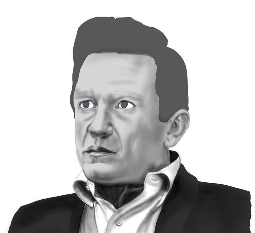
Next I create a new layer above the color block layer and select the air-brush tool. If I’m painting black and white (like the example) I choose the black color and begin to paint in details and shadows. If I’m doing it in color, I also use black or the darkest tone of what chunk I’m painting over (like the darkest skin tone for example). I use the paint brush at various sizes and opacity to achieve the look I’m after (smaller size for fine details, and larger for big shadow areas). My personal way of doing things is to paint major shadow areas and some finer detail lines at the same time, on this dark layer. Others may do it differently, but that way works best (and fastest) for me. That said, for hair at this point, I usually select a smeary-type of brush tool (something like the way oil paints would act on glass) and loosely paint in hair values in the basic direction the hair falls.
Once I get that just the way I want it, I will then create another new layer above the darks layer and paint in the lighter tones with the same air brush tool, only using either white or the lightest tones instead. The darks layer is where I paint shadows and most details, the lights layer is where I paint highlights, reflections (like on the eye pupil, etc.) This details step by far takes the most time, and I try not to rush it. The idea is to add in enough detail that I can remove the1st step pencil line drawing and not even notice. I shouldn’t need that in the painting anymore once I’m done. If I turn that layer off and the painting doesn’t hold together well, I know I’m not done putting in details yet.
 |  |
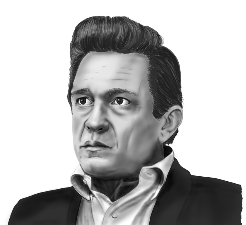
Step 4: Fine Tuning:
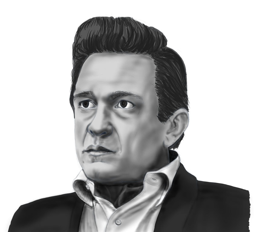
Once I get the shadows and highlights right, I create another new layer and add in some fine tuning. This is where I add in fine details like eyelashes, eyebrows, skin textures, clothing textures, and stray strands of hair. I use a thin/long brush for hair detailing. This step is basically to add in or correct anything I’ve done thus-far, and to tweak the image until I’m happy with it. I’m frequently still paining on the light and dark layers at this point too, making final tweaks to those.
Once I get the shadows and highlights right, I create another new layer and add in some fine tuning. This is where I add in fine details like eyelashes, eyebrows, skin textures, clothing textures, and stray strands of hair. I use a thin/long brush for hair detailing. This step is basically to add in or correct anything I’ve done thus-far, and to tweak the image until I’m happy with it. I’m frequently still paining on the light and dark layers at this point too, making final tweaks to those.
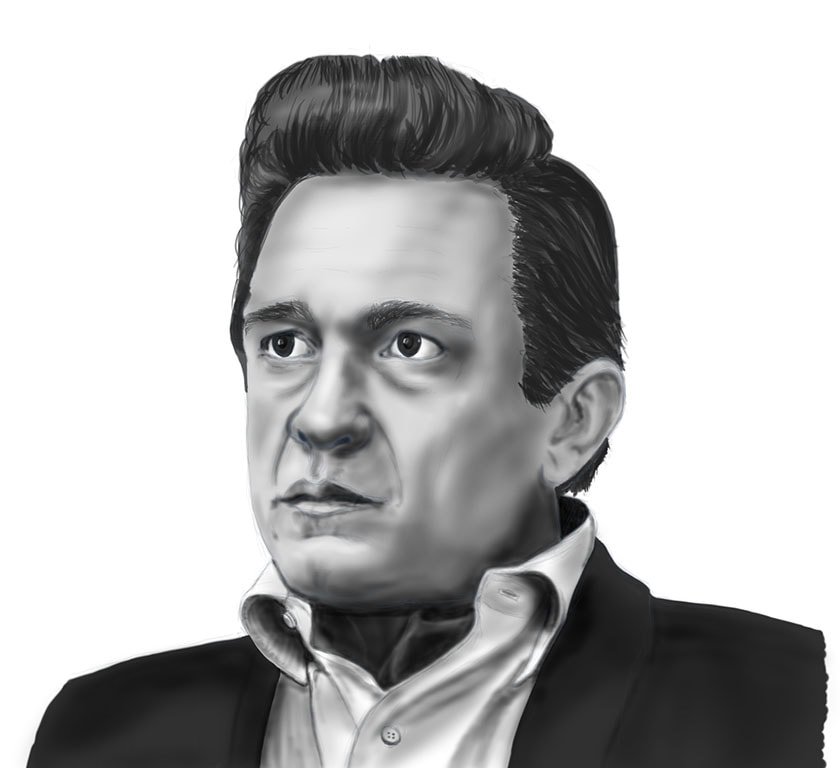 |  |
Step 5: Background:
When I’m happy with the portrait, I now decide on the background. I create another new layer for that and place it at the bottom. I usually just do something similar to what’s in the reference image, or sometimes I just do a gradient of a neutral color or gray. If I’m doing a portrait, I really don’t spend a lot of time on background, I just want to give the piece a finished look and make the person stand out as the central focus. Once I’m happy with how it complements the subject, I call the piece finished. Thanks for reading. :)
When I’m happy with the portrait, I now decide on the background. I create another new layer for that and place it at the bottom. I usually just do something similar to what’s in the reference image, or sometimes I just do a gradient of a neutral color or gray. If I’m doing a portrait, I really don’t spend a lot of time on background, I just want to give the piece a finished look and make the person stand out as the central focus. Once I’m happy with how it complements the subject, I call the piece finished. Thanks for reading. :)

See More of my drawings:
Just a reminder, I post all my drawings and sketches (digital or otherwise) on my Instagram account. See it here:
https://www.instagram.com/sketchdraw_j5/
Just a reminder, I post all my drawings and sketches (digital or otherwise) on my Instagram account. See it here:
https://www.instagram.com/sketchdraw_j5/
